Friday 31 January 2014

The Premise Behind the Picture


After doing a little more reading on Nighthawks, I was pleased to find that Hopper had actually provided something of a background on the painting, which makes it easier to analyse. I read in a book I took out of the library called 'Portraits of America' which explores Hopper's work. In it, he said this about Nighthawks:

It was suggested by a restaurant on Greenwich Avenue where two streets meet. I simplified the scene a great deal and made the restaurant bigger. Unconsciously, probably, I was painting the loneliness of a large city.' 
I appreciated this comment he made about his own work, and thought it was very honest. I have noticed after a brief look at what is said about his other works as well, that there seems to be a common bleak theme underneath the picture. People seem to get a sense of sickness, loneliness and death although it is not directly present.

Another thing I read in the book was that Ernest Hemingway was an influence on his piece, due to Hopper's admiration for his work, and in this case especially the short story 'The Killers' which you can find here:

http://www.unz.org/Pub/Scribners-1927mar-00227

This short story is similarly set in a diner, and you can really imagine that short story having taken place in the diner shown in Nighthawks.

Renovations.


Following discussions today with Simon, I feel like I could perhaps combine together my interests in nature and architecture and put them together into one idea. I've always loved architecture, and when he suggested it, my mind immediately jumped to the ancient world, especially Egyptian architecture. When they built temples, pyramids and tombs, they built with eternity in mind. Similarly across other cultures in the ancient world such as the Greeks, Romans, Aztecs etc. These landmarks which we identify with those eras have to some extent stood the test of time, however they aren't perfect. Slowly they have eroded, and have had to be restored.

To me, this says something about a mindset these people had that was common across the world back then and to some extent it is now as well. There is and has been a common human arrogance which causes us to think we are going to be able to defy nature and build things which will last forever when that simply isn't true, as I have already said in previous posts.

An example of this can be found in the pyramids. Egyptologisits believe that the original structure of the pyramid stood 480.6 feet tall however with erosion, the current height of the pyramid is 455.4 feet tall. That's enough of my rambling for now, but that's my current idea. I'm just wondering how I could possibly get that message of a lack of immortality across through architecture.

Experimental Sound Brief

For this brief we were all given a painting as a starting point to go away and research and use as a base for my project. My first thought was to research the painting, the man behind the painting, and the time that he lived in to gain a full understanding of the painting.

My painting was Nighthawks (1942) by Edward Hopper:


I had a look on a website that presented facts about the painting and the method Hopper takes to this work:

http://totallyhistory.com/nighthawks/

The writer of the article named Hopper as a historian, and that he used painting and drawing as his method for recording history, due to his many works on the state in which he lived in America. I took a look at some of his other paintings as well and I think I agree with that statement:


Gas (1940)


New York Movie (1939)

A few quick notes I made about Nighthawks as my pre-analysis:

  • Hopper has a very great consideration of light, and edges in his painting.
  • He depicts a night scene at a time when wearing suits and smoking was very fashionable.
  • The area surrounding the diner is quite scarce and empty, which I consider odd since nightlife in his home town was surely more populated than that.
Those are my preliminary thoughts for now, though I think I'll do a much more broad search over the next few days.


Light Spectrum


After looking at what humans miss in life in terms of what we see and notice, I decided to look at it from a different angle and a question I had previously considered; How much do we see in terms of light?

The answer is, well, not a lot. We see visible light but there is a whole other spectrum out there to view. Butterflies are thought to have the widest range in terms of seeing across the spectrum of light. Now, I know there is a way to shoot utilising waves such as Ultraviolet and Infrared, and so I had a look at them.


I found this film shot in Infrared film in Congo to capture the impossible, something we can't see. This article to accompany it that I found on No Film School talks more about it in depth:

http://nofilmschool.com/2013/06/infrared-cinematography-documentary-the-enclave/ 

I also had a look at shooting in Ultraviolet, and found a photography project which I found very interesting.


This project, and others have mainly focused on the human form and have been able to show the layer of skin directly below the epidermis, which creates and interesting effect and reveals a lot about the human form that we don't usually see.

Those are my thoughts are the moment, and I think perhaps I could take this idea further in some way and try to interpret it into something I can actually make for a film, since I have set cameras I have to film on and so it is unlikely I could shoot in infrared if I wanted to, and also it would be fairly ambitious to do so.

Image Glitching Exploration

Following my conversation with Rosie on my photography project, I decided to explore the idea of glitching images and removing data in an accidental or random way. I agree with what she said when she suggested that the random and accidental essence of image glitches was something I shouldn't really want to lose to follow my idea and create a full effect.

After some quick googling, I quickly came up with some ideas of how corruption in images can occur:

open the file as text using notepad and delete the first 10 or more lines of text and replace with a bunch of random letters and numbers.

 This post was in a forum from a few years ago and I was unsure as to whether this would work now because of the advancement of operating systems and programs in windows. I was proved right when I tried it a few times and the file came up as corrupted and not view able.

Next I looked at possible online programs I could use to create a similar effect.

The first few images are from a site called Corrutus 3.5, which is a web program where you upload a photo to the site and you click a mode you want it to take in the method of glitching your image and you get a few results to choose from:


The good thing I found about this method is that it is completely random, providing you don't know all of the modes and what they do. The site tells you how the glitching is achieved and you leave the rest to them.

I then tried another site which is an image glitch experiment. In this one, you can upload an image and control the amount of glitching, and how it is glitched, or you can also completely randomise it:


I liked the effect that this gave, although I was disappointed somewhat as the glitching was all very similar, with just different colours and different parts of the image showing, which I felt wasn't random enough and didn't reflect fully what I wanted to show.

The drawback of both of these methods is that they are relatively easy to achieve, and while it creates a nice effect, I feel like it wasn't self-created and I don't know whether I'd be happy letting something else create this corruption. So, I looked at more ways I could create this effect and came across the suggestion of a HEX editor in a forum, which would allow me to change the values of the data in the jpeg to create something perhaps that is viewable, although I haven't had chance to experiment with it yet. However, I would like to experiment with corrupting CR2 files as well as jpegs to see what effect that may give as well.

Thursday 30 January 2014

The Three/3.5 Ideas.

Now that I've done some research I've come up with some ideas for this multi-screen project.


My first idea is based on the original research I did on nature reclaiming the earth. If I were to do this project, I would want to animate leaves and vines moving through the three screens, wrapping around objects. As I already noticed in the after effects tutorials I have looked at that I could do this and make this look very animated. Essentially, I want to have three different elements of the earth being retaken; a dissolved statue, a carved tree being overgrown with moss and a human hand being wrapped up by vines. Another element I want to consider trying is having three kind of planes in each screen. So almost as if there are three different plates, back plate which is moving one way and has some animation of a backdrop, the middle plate which would be the object and the front plate which would be leaves, vines and perhaps a vignette type effect.


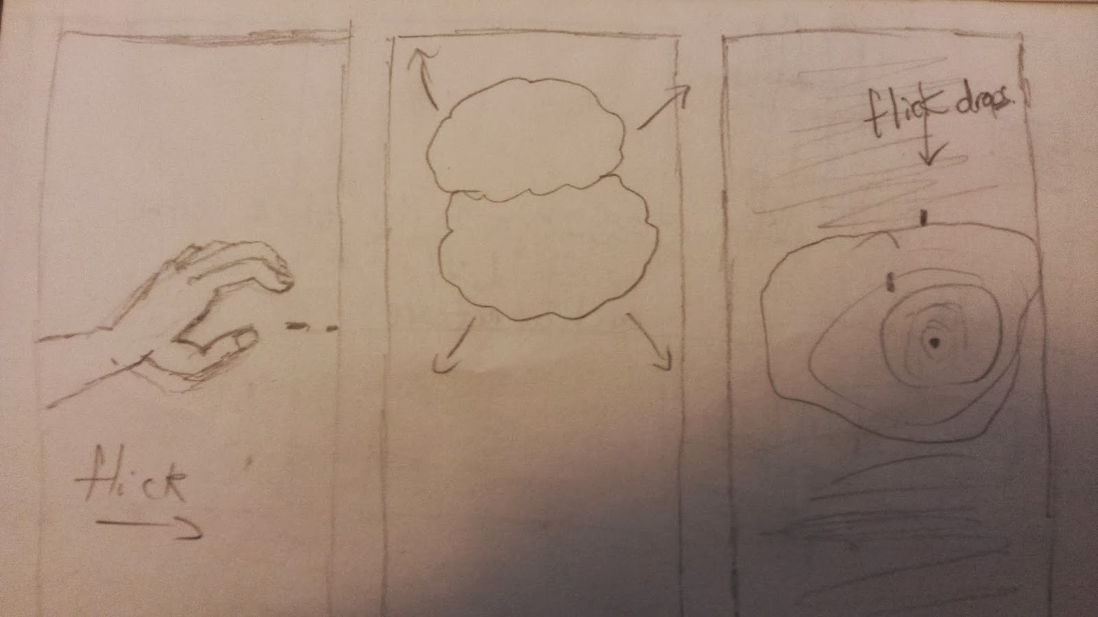
My next idea is to explore the water cycle. This is a lot more simplistic and minimalist than the full on idea of the nature reclaiming, but I think it could be very interesting. I want to explore water in terms of rhythm and consistency through the interaction of the three screens. For example, like the image above, a hand could flick water from the left screen and then drops could splash in a puddle on the right, with clouds brewing in the middle. If I could show this in different forms, and have things moving from one screen to another and have things changing, I think this could quite effectively show cycles and rhythm in nature.


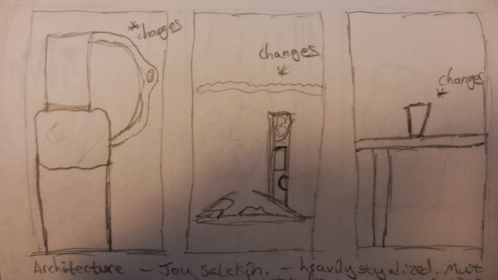
My final idea is in part, two ideas relating to the same theme. However I feel there is room to combine these ideas into one piece, and really I just couldn't discard one of them. This idea surrounds changes in architecture through time, however bringing them all into once space and jumbling them up and fitting them together like a puzzle. I guess this idea is about bringing lots of differing pieces of architecture into one space as a comparison, and bringing them into the same time period.

The top picture shows an idea of having three panels of different walls, different pieces of architecture, and having parts of them fragment. Similar to multiple TV screens of noise, but with digital fragmentation like in a photograph as well. Every time this would happen, a new piece of architecture would be inserted in its place to a rhythm or piece of music. However, I'd like this to be able to loop smoothly as well.

The bottom picture shows a more complicated idea. The middle screen is the main focus and is an empty space, like a field, which fills with the fragmented parts of different architecture to form a structure of their own, but moving and changing all the time. As I think of it, I can imagine it moving, growing and decreasing like a beat in a song and especially in the video of 'She Wolf' by David Guetta:


The two screens either side of it could show either the same or different things. My original vision was to have close-ups of different parts of the structure changing, so that the viewer gets a better view of what is happening. However I felt I could dedicate that to one screen, or both screens and then moving on to just one. The screen on the other side I feel could show what's inside the structure, changing also to represent the changes of eras and the times that these fragments of buildings represent. However I recognize that might be quite difficult to achieve so I perhaps show that in a simpler way.

Internetting.

When considering how I could achieve my ideas through after effects based work, I had a quick look around Youtube and had just a general google on some tutorials that I could perhaps use to apply to my work.


If I were to do my project on the water cycle, and involving water, I was thinking of perhaps how I could simulate liquid using after effects. I have little understanding of how this is done, and have only really seen before how it can be created using modelling tools such as Blender. I found these tutorials in the Creative Cow channel which gives me some idea of what I can do, and what kind of look I can get with it. Obviously I'd need to do more research and tests, but this is a good place to start.


Next I had a look at I could perhaps generate 3D architecture in After Effects, and how I can create 3D from a 2D image if I were to try and do a project on architecture. This is quite relate able to the tutorial I did the other day about animating a still image, but with a different result. I think, depending on what kind of thing I wanted to do, I could find this quite useful.


I then looked at if I perhaps wanted to simulate leaves or growing things in a project on nature reclaiming the world, then I looked at how I could do it. I realised by looking at this that of course, due to the limitations of my time and the limitations of the program that it would probably be a lot easier to create a project that was stylized to look like a sort of animation. I think this could be done quite effectively, and I have some idea of how I could do it.


Lastly, I looked at this tutorial on camera mapping as a general tool for any of these projects. If I want to create something 3D then using a camera is going to be necessary, and if I know how to use that camera to a fuller extent then it would give me a lot more options in terms of what I can do for my project. So, this tutorial was something I could find really useful.

Wednesday 29 January 2014

How Much Do We Really See?

After a chat with Rosie about my ideas, I started talking about how much of what we remember did we actually see, and how much have we made up? It came as something I was thinking about in terms of fragmented memory and how the brain remembers. Looking at cases of complete falsified memories was really intriguing. I thought perhaps for a film idea I could explore this in an experimental way, so I started researching the topic.

Take a look at this information I found in an online article, which you can view here:

Picture the following, and prepare to be amazed. You're walking across a college campus when a stranger asks you for directions. While you're talking to him, two men pass between you carrying a wooden door. You feel a moment's irritation, but they move on and you carry on describing the route. When you've finished, the stranger informs you that you've just taken part in a psychology experiment. "Did you notice anything change after the two men passed with the door?" he asks. "No," you reply uneasily. He then explains that the man who initially approached you walked off behind the door, leaving him in his place. The first man now comes up to join you. Looking at them standing side by side, you notice that the two are of different height and build, are dressed differently, have different haircuts and different voices.
It sounds impossible, but when Daniel Simons, a psychologist at Harvard University, and his colleague Daniel Levin of Kent State University in Ohio actually did this experiment, they found that fully 50 per cent of those who took part failed to notice the substitution. The subjects had succumbed to what is called change blindness. Taken with a glut of recent experimental results, this phenomenon suggests we see far less than we think we do.
Rather than logging every detail of the visual scene, says Simons, we are actually highly selective about what we take in. Our impression of seeing everything is just that-an impression. In fact we extract a few details and rely on memory, or perhaps even our imagination, for the rest. Others have a more radical interpretation: they say that we see nothing at all, and our belief that we have only to open our eyes to take in the entire visible world is mistaken-an illusion.
Looking at this, it seems that there's a potential for breaking down what we see and what we actually remember. I can recall parts of my own past in which I can remember something being one colour, when in fact it was another and events which never happened in a particular place, but did happen somewhere else. This kind of thought leads me to La Jetee, which has a very static feel as it tells a narrative using images, which gives you time to view the whole image and maybe playing with the frame rate of a sequence might give a perspective on that. This is very much like 24 hour Psycho by Douglas Gordon, which is Pyscho by Alfred Hitchcock stretched to be 24 hours. In observing each frame you realise something you never did before when watching the film.


Also this makes me think of a video I saw many years ago which, like the article at the beginning of this post, shows what we do and don't see:


Not only this, but film-makers use techniques all the time to lead your eye and hide things that aren't quite right, and magicians do this too. It's such an interesting part of human psychology and I want to explore it further. Perhaps I could explore what other animals see compared to us? There are certain light waves we can't see too, what would the world look like through the eyes of something else? How much and what would we remember then?

Curves and Straight Edges.


My look at water and rhythms and movement in nature led me also to think about architecture and how that changes and has rhythm and movement too. As a child I was always very fascinated by architecture, and even now when I go to a new place I often trace the lines of the room, wanting to know how it was built and figure it out.

Looking at 'The Third & The Seventh' was a good place to start as it was something Simon showed the class before we took on this project fully and it shows the capabilities of CGI, and also shows a lot of interesting shapes and architecture. Obviously I don't have the time or the knowledge to achieve anything like this for this project, but it is something to aspire to and has an aesthetic that perhaps could be applied to my work in some way.


The next piece of work I looked at was this one, and it was very interesting in the time it must have taken to make, and the perspective it gives of architecture, old and new. It was made using carefully taken still images and then the rest was done in post. The effort of this is remarkable, and it creates a very time lapse effect/illusion which I find remarkable. It also gives me a few good ideas on how I could play with still images, along with the after effects tutorial I did recently. Take something very simple and make it more complex as it were.


The last thing I really looked at that involved some architecture, but was more about pace and style was this film, again by someone I knew at college. It's a heavily stylized piece which does look at architecture around London at some interesting angles, but the use of split screen and the music and the visual style creates something very dynamic and gives me something to think about in terms of colour and pacing.

Waterworks.


After my short exploration of cycles, and my look at some more triptych's, I realised that there was the potential to explore cycles further and namely the water cycle as I mentioned before.

Although I already have an idea concerning nature, that is more about the change in nature and is much more of a broad look at nature in general, whereas this is much more specific. Cycles in nature is much more about the rhythmic element as well as again the consistency of nature through time. My first thought when looking at cycles was a short film a student at my previous college did which was aptly titled 'Cycles' by Jason Bartlett.


This film looks at a lot of different cycles such as day and night, water melting and a sort of daily routine style. I thought it was a good place to start as it has a very conventional time-lapse look at time passing, yet it employs some nice techniques also. In doing this it made me aware of how I could shake up the look processes and cycles.


My next stop if you like was to vimeo to see how this theme had been explored in a more experimental way, and I stumbled across the film above. It's a nice short piece, and is the same length my film needs to be. The multi-screen element was also a bonus. I liked this film because there was a sort of hidden sense about it, like it doesn't reveal all because of the woman especially being slightly off screen and her face not shown. There is also a rhythmic element to it in how the screens change and move along.


Another experimental I found including water was the one above. It was very simple like the other one, and again uses a multi-screen/split screen element. This one was interesting because of the style. It has a particular style to it, and is quite hypnotic as it shows water movement in an interesting way. The music also helps a lot with that atmosphere.

I could definitely see myself doing a project based on the water cycle, looking at the many ways in which water moves and the rhythmic, consistent nature of it because of that. However, I need to think about how I can involved after effects into this to create something experimental and different, and to fit the brief also.

Tuesday 28 January 2014

Dealing with Images.

After my look at cycles yesterday, I decided to talk to someone about my ideas and in doing so try to generate something more solid. It became evident to me that I need to think carefully about how I execute the idea and how long it will take me to accomplish.

I looked at a few more Triptych's, and found a comment on one of them that got me thinking.

I found this on a page that wasn't written in very good English, but something I picked up from the article was:
'three images interacting dramatically, thematically, rhythmically, in beautiful ways'
This gave me a pretty good idea of how an audience might respond to a triptych. I already mentioned that I feel the images need to acknowledge each other in some way, and I think this puts it into perspective. Looking at the piece, you can see how things line up, and how you can see different perspectives of the same thing.

Similarly, another one I looked at:


This one in particular focused on the emptiness of a space, the singing in the tunnel was the opening of a new water system, and using the three screens meant you could show many aspects of the emptiness at once, to gain a full understanding of why the singing is so contrasting, and thus making it more powerful. The conjunction of the images creates the meaning as is with editing in general.


Lastly, this one I looked at to try to understand how I could execute an idea digitally, as well as using footage. As this project is so open, I have the option to create something entirely in a digital environment, or by using footage as well. I found that by looking at this piece, I can see how I could create something digitally, yet focusing in on small areas much more to make it more doable in the time I have.

After my look today I want to look more at rhythms and timing, and also I may want to play with colour and style of my piece as well, I want this to be something visually dynamic so that you would be made to stop and look at it, even for a moment.

The Next J.J Abrams?


Last week we were given a tutorial from Video Copilot on animating a still image to make it look like it is moving. The above result is what I came up with, and overall I found the tutorial very useful, and saw how I could apply it to my own work during this project. Having used Video Copilot before when trying to create new effects on previous work, I was familiar with how those tutorials worked.

However, I didn't stick entirely to the tutorial in some ways as I didn't like the personal style of that complete effect that much. For one I didn't have the optical flares plug-in Andrew used in his project, but I disliked the flickering of the flares he used also as I found it to be too distracting. Also his light on the flare was very warm, and I found that distracting as well so I opted for something a little lighter and more natural.

Changing the colour to the lens flare was slightly more complicated than the tutorial as after effects does not give you that option naturally. So, to create that I used the lens flare effect provided and attached it to a null object, then put an adjustment layer on to that null object and played with some colour correction tools.

Also, the multiple ways he showed me to create a camera shake was nice, but when I tracked the real footage and applied it, I found that I personally didn't like the amount of shake created from that footage, so I just used the digital shake created and made it more shaky by changing a few values. I understand the importance of using real footage for a more realistic look, but I felt that was going a little overboard.

I think the effect turned out pretty well in the end, and I'm pleased with it. Here's a link to the Video Co-pilot tutorial if you don't know of the site currently: http://www.videocopilot.net/tutorials/animating_a_still/

Monday 27 January 2014

Cycles.

After researching a little further about the use of triptych's in film, I feel as if I should research more into the idea of time. I still want to stay focused on the idea of nature and time, but my first idea was more to do with changes in nature over time. However, nature is also something which has repeating elements and cycles which I could experiment with in a triptych.

Immediately my first thought is a natural cycle such as the water cycle:


This is something which is consistent regardless of things such as climate change. The process doesn't change, the rate however may do. This element of consistency in film might be something interesting to explore.

Then of course, there is also cycles such as seasons:


I could possibly look at different elements of seasons in a triptych, highlighting different changes. However, seasons is a very cliche thing to lean towards and I would rather do something less explored, less evident than this.

However, another thing about cycles doesn't necessarily have to be about the theme itself or the element I am displaying. The triptych could be a cycle, but the image itself could just represent a moment in time, or the moment in a particular cycle. For example, I could have a seemingly still image that does move and change in the screen, but loops subtly so that you may not know if it is even changing. 

You must answer me these questions three.


Even though I have a rough idea of what I could do for my piece, I still feel like the idea hasn't been fully considered. I'm unsure as to how I could transfer my idea to three screens. To get an idea of how I could use the three screens effectively, I looked at some film triptych's online.

The one above was something I found on vimeo, and I thought it was really interesting as it uses symmetry between the screens for effect, yet also doesn't use them all at once at times, flashing them on and off. I like this because it shows how I can use the three screens to interact with each other in a subtle way, and also how to use them not necessarily in time with one another.


This next one is more of an example of how a triptych can be used to show multiple perspectives of the same thing, in this sense it is for more of a commercial aspect. However, the placement of the screens is also interesting, it gives an idea of levels and it helps us gain further perspective of what we are trying to view; cars in this case. The triptych also at points gives a sense of rhythm and acknowledging the fact that this is on three screens. This then creates a more aesthetic appeal. It shows the audience that the company are using as much of the space as they have in as much of an effective way as possible.


This video art triptych shows different aspects of a supermarket. The music and the sound scape creates a sense of the day to day, and the fast paced atmosphere of these places. Using different speeds at points further emphasizes this and showing multiple repeating scenes as well as sounds does this also. 

Overall it seems rhythm and timing is very important when using three screens. It feels to me as if acknowledging that you are using three screens in some form to use them to full effect. 

Works on Nature


Referring to my last post, I've started looking at works which show in different ways how nature will reclaim the earth eventually. I used search terms such as 'human arrogance in art' and 'nature reclaiming' to come up with some results. 

The picture above was something very interesting, and something I found by accident. It is from a collection of sculptures by a Japanese sculptor called Ishibashi Yui. This collection is all based on a human-hybrid concept, and I personally think it is very interesting and relevant to my project. 

Also, I remembered a documentary I had seen a while ago on TV about nature reclaiming the earth if humans just suddenly disappeared. It's a History Channel documentary series called 'Life After People' and handles the biological changes that our man made world would undergo:


The first episode.

It's an interesting idea, and looks at how our world will decay after we have gone, and demonstrates how we don't in fact rule the planet.

Creative Writing


Today in our creative writing lecture, we were taught more about how to approach screenplays, and were given the exercise above, which was to cut up words from a newspaper and create a story or at least make some sort of sense with it. 

For those of you who may not be able to read it, it reads: 'Police advise Viv Groskop you can trust flat-lining balls. Your future could make a lasting sex chamber. An incredible response! David Nieper invites you to get ready for an x-citing expert service at Aldershot's beautiful bachelor pad with a Chinese musical legend.' Overall I found this exercise very comical, but I can see how it would be useful in a practical sense as well.

We were also given another exercise to take a newspaper article and pick a word at random. Once we have done this, write down the word and the three words either side of it to have a seven word phrase. Then, using this phrase we should write freely for five minutes. This is what my phrase was:

'I was left gutted, because I had' and this was my response:

'I had hoped that perhaps in some fantastical and impossible way that I would be remembered and even perhaps saved. However, I was left gutted of all feeling in the dark corner of an angelic room. Is such a thing possible? I'm not sure. Perhaps it is just in my mind. Though I don't have much time to think about that now. I hear footsteps, and real or not they are coming for me. My stomach drops and that gutted feeling recedes and is replaced by something even less desirable. Fear. The handle I can just glimpse twitches. My eyes widen. What happens now?'

As you can see, I created a kind of narrative through free writing. It doesn't all make sense but I could develop it into something. The next stage of this exercise was to take a phrase from this free writing piece and turn it into something a little more concise. The phrase I chose was:

'I was left gutted of all feeling in the dark corner of an angelic room.' Again, this was my response:

'Throbbing in an indistinct area cause me to wake. Still with unopened eyes I reach up with heavy arms to touch my head. Wetness I needn't look at makes the severity of my situation more evident. Bruised, broken I lift myself into a seated position, shuddering as I lean against the icy wall on my left. My eyes flutter open, and blurs of colour focus into a crystal image. Stark white sunlight cuts through blood soaked, rose white curtains. Following the trail of red on to oak and dazzling marble, I begin to wonder why I am in a beautiful room such as this, only to stain it with my impurity? Then I remember. Welling up, I realise how forgetful I am. I had hoped that perhaps I would be remembered, or even saved. However I was instead left, gutted of all feeling in the corner of an angelic room. I hear footsteps, my stomach drops, and all my hopelessness recedes into something worse. Fear. The handle I can just glimpse through the tainted flowing fabric twitches. My eyes widen. What happens now?'

As you can see I added a lot more description and creative language. You get more of a sense of place and character, and this is now something I could develop into an actual story. This exercise was especially useful for coming up with ideas, and may actually help me develop a film idea. 

Thursday 23 January 2014

Seems Good.


While on the subject of fragmented memory or false memory, I remembered something I had heard about in a youtube video once. The channel Vsauce, handles difficult life questions and tries to break them down to find an answer. In particular, this video was about deleted files. The picture above is part of a collection by a photographer called Melanie Willhide, which came about after her laptop was stolen and later recovered to find her photographs deleted. She used recovery software to get the photographs back, but they were corrupted in a very visual way such as the one above. She later used them in a collection which she named after the thief, Adrian Rodriguez.

Another from the collection:

This got me thinking about how fragmented memory could be used visually, and an idea struck me that I think I could use for the photograph series portion of the Reflections unit. I feel that I could perhaps take the same photograph 5 times with details of it changed to show a confusion over the reality of a moment in memory, or I could use a post-processing technique similar to the result of the accidental corruption by Rodriguez, and in a similar fashion use the same photograph five times and digitally distort parts of the photograph as if there is data missing like fragmented memory.

I think this could be a really interesting concept if I did it properly, though this idea may require more development and research.


Memory in Photography

As well as coming up with an idea for a film to do with memory, I have to also create a series of 5 still images to do with memory. From my previous posts you can see I have been researching about what it is to remember something, and fragmented memory or false memory in particular. However, a lecture revealed to me other ways of looking at memory in photography.


This is probably the first photograph ever taken.


This is the largest camera ever made to take the largest picture ever taken.

These milestones in photography are an interesting way at looking at memory I feel as it's important to remember key points in certain parts of history that interests you.

Re-appropriation.


As a short exercise, we were asked to use re-appropriation to destroy consumerism. As a starting point I searched on Youtube for TV ads. Obviously quite a few results came through, so I searched for full versions, perhaps uncut versions which would be more suitable for my minute long target. That is when I came across an extended Ann Summers ad. It was very suggestive and was very well shot, and so I saw it as a perfect target for re-appropriation. My first reaction was to do something to do with the aftermath of sex, namely children. This is because I feel as if advertising always focuses on the present, what you need or want now, and disregarding the future completely, especially in adverts such as this and this is a major problem in a world rife with high rates of teenage pregnancy and other accidental pregnancy. To show this, I found clips from other ads of children crying and edited them into the ad at points to disturb the flow of it.

Out of this, overall I felt that the ad was received fairly well. The criticism I got mostly was that it wasn't obvious enough what I was trying to do and perhaps if I had edited more clips of children into it, then it would have been more easily identifiable.

Saturday 18 January 2014

Was I there?


Cold Knap Lake by Gillian Clarke

We once watched a crowd
pull a drowned child from the lake.
Blue lipped and dressed in water’s long green silk
she lay for dead.

Then kneeling on the earth,
a heroine, her red head bowed,
her wartime cotton frock soaked,
my mother gave a stranger’s child her breath.
The crowd stood silent,
drawn by the dread of it.

The child breathed, bleating
and rosy in my mother’s hands.
My father took her home to a poor house
and watched her thrashed for almost drowning.

Was I there?
Or is that troubled surface something else
shadowy under the dipped fingers of willows
where satiny mud blooms in cloudiness
after the treading, heavy webs of swans
as their wings beat and whistle on the air?

All lost things lie under closing water
in that lake with the poor man’s daughter.

This poem for me, makes me think of memory in a very different way. From what I understand of it, the lake is a metaphor for the author's head, and the lake itself consists of her memories. These memories then get muddled and cause false memories, like the memory of her mother saving the child from drowning. I've always liked it as it presents an excellent metaphor for the experience of having a false memory.

Here is another piece of artwork dealing with false memories, called False Memory Archive which is currently touring the UK: http://www.falsememoryarchive.com/

There is also some compelling court cases which may question the use of repressed memory as the main argument for a prosecution of defense, purely under the argument of a false memory having  been created. It is interesting to see either side of the argument:

Catalyst: False Memories - ABC TV Science

I think this may be an interesting topic to create a film based on memory. You could go in many directions with it and it provides some flexibility to be very creative in the way I approach it.

Psychology


After thinking about memory, and how after a few minutes, days, years, memories can fade. The normal human brain can't recall memories from a few months ago as easily as a few minutes ago. However, there are cases of people who remember every detail and day of their lives as if it happened yesterday. This is an extremely rare condition called Hyperthymesia.

This documentary by the Nobel Prize deals with a case of it at the beginning:


I found it very interesting how this Lady describes her experience of this condition as like having a split screen in her head, and how she recalls seeing memories as if they are happening at that moment. I can imagine it might feel like you're leading two different lives in your head. I think this is also a more alternative way of thinking of memory, as opposed to focusing on the memory of a normal human brain. This documentary explains the science of memory to some depth so it's worth a watch for that as well.

Friday 17 January 2014

Where in the food chain are we?


Nature is an ever changing, yet ever constant thing. It is always there, but never exactly the same as it was just then.

In class today we were taught by an artist called Vicky Smith who was showing us how to research for our After Effects based projects. In this lesson we had to do the dreaded group mini-exercises and try and develop/come up with some ideas. Now, if you've seen my previous posts regarding my research into artists such as Andy Goldsworthy, then you will know that my ideas have been mainly regarding natural change. As such, I told my group about this idea and just talking about it made me realise some things about myself:

  1. I concern myself with the idea of nature being the true ruler of the planet.
  2. I believe humans are arrogant beings.
  3. I like the idea of making work that is related to something tangible.
Out of this discussion, my group made some suggestions of how I could show the desctruction of man made things through being reclaimed by nature. For example, showing small elements of a forest with perhaps footprints or carved letters in a tree, and then watch in a time lapse style across the three screens in which this piece will be displayed, how nature reclaims them. However, I feel this is too obvious. It's a nice idea but I think it's so easy for us to not care about nature and for us to be detached from it. So instead, I would like to develop this idea to be perhaps something more sinister for us as human beings. Something that we will be more inclined to relate to.

Also, as this is an After Effects based project, I will have to consider how I can incorporate digital effects into this, and as nature is so free flowing, how to perhaps simplify some elements so as not to create something too complex. I will have to do some more research on it.

I will leave you with something this topic reminded me of:


An Amaryllis is a flower which grows in the desert, it's very versatile and can live with little water. It also blooms all throughout the year, and can also bloom indoors. It's an amazing, and often overlooked beauty which highlights exactly what this post is about.

(img: "Nature Reclaiming"- http://www.flickr.com/photos/philandpam/ used under the Creative Commons License.)

Video Art?

Some people consider art to be something that has a reason for being made, and a considerable amount has gone in to making it. I'm not sure whether I believe that, but one thing that concerns me is video art. With the accessibility to shooting equipment nowadays (DSLR's etc.) can we really call that kind of amateur style camera work art?

Looking at a couple of pieces I consider to be art, you can see how it is possible to create a deeper meaning through video specifically:

The first piece that caught my eye was called Mercuriús on a collection DVD of video artworks. It was essentially a collection of film footage and amateur footage that all incorporated the light of a torch as the subject.

The gaze of the torch is very curious, and inquisitive if personified. However, the cuts between each shot especially at the beginning makes it sinister, with a horror film tone that reminds me of something akin to The Blair Witch Project or the youtube channel Marble Hornets, which you can view here. Similarly the music crackles and holds that amateur, fragmented sense that the film carries, in turn making it more sinister and bewildering.

For me I think this short film was trying to demonstrate something of a similarity in the way films are shot using strands of light and, because of this, the effect it has on us as an audience. Personally I felt a bit on edge throughout it, thinking something was going to happen or jump scare me, which really goes to show what this film was giving to us.

Another film in the same collection called Falsche Freunde deals with a lot of slow motion clips with no narrative and it cuts in a very fragmented way in the sense that it often cuts to black before the next shot. This to me makes it feel quite dream like and fictional. However, this film again has a sinister element without any immediate reason as to why, the conjunction of images and the overlays in the film makes it feel sinister when put in conjunction with the soundtrack which sounds very unnatural. It also reminds me of a video related to the Marble Hornets youtube channel called TotheArk, which can be viewed here.

The clips used mainly show a boy hiding and a shot from far away of two men going into some sort of institution. The nurse figure opens a door to let them in, entirely in slow motion whilst the boy acts to be hiding from them. I feel as if this is mainly why the film appears to be so sinister. There is a sense of distrust of institutions and authority about it.

Both these films I feel I could call artworks as there is a meaning behind them, and their techniques are completely justified and are actually delivered very successfully.

Thursday 16 January 2014

Unease

On our second day of screening for this project, we were shown a documentary by Johan Grimonprez called Dial H-I-S-T-O-R-Y, which is essentially a history of hijacking on planes and attacks on airports. It has other things to say of course, but that is what it is presented as.

It is a very intense experience. In terms of editing there are cutaways to seemingly random imagery, such as rats dying. It is sinister and also very funny in a dark, ironic sense. With a use of juxtaposition of images and pop music to create irony, like images of staff mopping up blood for example, it's very easy to see the opinion of the director on hijacking and the issues that surround it. However despite this intense and disturbing nature of the film, it is constantly engaging and it definitely gets across many different messages about hijacking, and it is very reflective.

The messages of this film can be interpreted in many ways. Clearly it is not a film about just hijacking in a chronological and historical sense, rather it uses that as a basis for demonstrating to the audience a number of facts in the form of archive footage which we can interpret in any which way we please. For me, I get messages of governmental officials having not taken hijacking seriously when it first started, of a question of justification of hijacking as the people doing it want to get the attention, the help they need from us, and also a recognition and belief in the society of the spectacle theory.

With regards to when this film was made (1997) 09/11 obviously had not happened yet and so this film somewhat applies prior to that, in a time when people took it less seriously than they do now. However in many ways you can see how Johan saw 09/11 coming. Now, I say that they didn't take it seriously based on moments in the film when people who had been in a plane which was hijacked (mainly Americans) were recalling how exciting it was and with the press asking them what they ate and other non-important things. It actually fills me with anger to think about it. It all relates to the society of the spectacle theory which means that we as a society are attracted and engaged by large events, including tragedies such as plane crashes and hijackings. Also in many ways it highlights the extremities of the media, and reveals journalists as the major reason for hijacking being an effective means of publicity.

To support this, it uses footage of interviews with hijackers to show an alternative side of the story, which brings about an interesting point of view. From the film's perspective, it seems that the western world does not understand their troubles and that we refuse to help them fight and keep their people alive. To me this highlights the message the film is trying to present that we didn't take hijacking seriously enough and that is why it continued to happen. In some ways, 09/11 gives us a very unique hindsight into perhaps what should have been done earlier.

An extremely well delivered, engaging and darkly enjoyable film that I will be watching again.

Wednesday 15 January 2014

Blue


By the time of his 1993 film Blue, Jarman was losing his sight and dying of AIDS-related complications. Blue consists of a single shot of saturated blue colour filling the screen, as background to a soundtrack composed by Simon Fisher Turner, and featuring original music by Coil and other artists, in which Jarman describes his life and vision. When it was shown on British television, Channel 4 carried the image whilst the soundtrack was broadcast simultaneously on BBC Radio 3, a collaborative project unique for its time.
Jarman's work broke new ground in creating and expanding the fledgling form of 'the pop video' in England, and in gay rights activism. Several volumes of his diaries have been published.

We watched only part of this film as a class. At first I was slightly confused, even with knowing the background information. The soundscape and the dialogue in the background is slightly disorientating as it forces you to rely on senses that we often take for granted. It is an interesting insight into the perspective of Jarman in his last days. I love how immersive it is, it's a way of bringing the audience into the film and really showing them what it is like to live through the film's main character, in this case, Jarman himself. Also, it's very hypnotic and ambient, and quite soothing in a way. The noises and the consistent monologue is something I could perhaps sleep to, in a good way. Though the fills me with a sense of unease that it has that effect, it gets me to question the world around me and see it in a different light. It's a very interesting insight into the life of someone else, and presented in a very memorable way.

La Jetee vs Twelve Monkeys

After our screening of La Jetee on Monday, I was left quite bewildered as to what the story was trying to tell me. I understood some of the story, such as that they were going back in time from a post-apocalyptic style future, but little more than that.

The storytelling style was something that reminded me of a kind of radio play, or a story told using pictures and sound effects on a children's TV program. Taking into consideration the time it was made in (around the time of the French New Wave) I can take into account any styles I am not familiar with. However, the story itself is a bit difficult to comprehend, and even the Hollywood version of it, Twelve Monkeys, can be a bit bewildering at times.

Overall it's nice to see how both stories differ and how they are both similar. The pure nature of the original, the length and style and such lends itself to be a simpler story. The core elements of the story are there, but from what I can gather the protagonist is collecting information in a lot more simplistic way than in the Hollywood version, and it almost feels a lot more calm and freely flowing than the Hollywood version. Whereas in the Hollywood version you have Bruce Willis and Brad Pitt stomping around, with a more action feel to it and a more sinister undertone, the story has been fleshed out to create a larger sense of good and evil, of a distinct purpose. Although it is catering to a more action hungry, and less patient audience.

Personally, I preferred the original for its unique style of storytelling and it is visually intriguing throughout, although it is a bit confusing. The Hollywood version has its benefits too, in a sense you gain a greater understanding of the story and that helped me appreciate the original more, however it is a good film in its own right. I just don't go for that kind of action thing. I feel that the original told the story well enough without needing to do all of that.

Tuesday 14 January 2014

Something Blue

The last thing I decided to do for this task was a nod towards my hobbies. Outside of being a film-maker and a lover of the digital world, I enjoy doing things creatively that have also been around for centuries. I often find myself battling with the necessity of the digital and the distrust I have for it. As someone who knows and is familiar with many elements of digital life, I trust it very little. I think we rely too much on it, and although it is important, and technology is the future and I embrace that, I sometimes feel that you just can't beat being able to make something physical, something real and tangible. As a result, I spend a lot of my time knitting and making complicated origami figures, because I love having a skill like that.

To memorialise this, I knitted a square in a pale blue, and made a simple origami heart, using needle and thread to bind it.


Recycling

As a student, I feel that most students get a bad reputation when it comes to their diet purely because, well, they tend to eat a lot of rubbish. Pizzas and take-outs. Not me though, I love cooking too much. I love experimenting with dishes and flavours. So, when I look in my purse I don't find a load of receipts for Subway or Dominoes. Also, as much as I am a film-maker, I love creating new objects out of recycles materials and it is almost always things you can use. So, to memorialise my love of recycling the old to create the new, and to memorialise my attitudes to my own purchases and diet, I made a purse out of receipts:


Roots

As someone with an extremely large family history, I feel I need to memorialise my interest and my acknowledgment of that in some way. We have a confirmed history of one line of my family back to the 1400's, which is quite something really. This idea came to me when my nan asked me to scan some old family photographs into her computer for her. Most of them were pictures taken in the late 1800's to the early 1900's, and they were mostly postcards as well. I found this notion very interesting as I'd never thought of family portraits being taken as postcards. However during the 1800's and 1900's it struck me that Britain were at war a lot, defending the empire and such, so of course it was natural. Here are a few of the postcards in question:


Taken between 1894 and 1901.


Date unknown. Taken in a photography studio in Commercial Road, Portsmouth.


Date unknown. The adults are my Great-Great Grandparents and the child with the attractive glasses in the front is my Great Grandmother.

I am fascinated by things like this. Just knowing what they looked like, knowing who they were makes me excited. To memorialise this, I recreated a family photo by superimposing myself on to the background of one and printing it as a postcard. Here is the picture I was using as a reference:


And here is my take on it:

Front:


Back:


Fashuuun

I've always found it fascinating how my own styles in clothing change. All throughout my life I've actually been able to observe the changes, without even attempting to stop it. Self-reflection has always been something I'm good at. Most recently my sense of colour has changed, along with my longing for practicality in my clothes. I no longer want to spend £20 on a bunch of stuff from Primark as it doesn't last 5 minutes in the real world. Maybe that's a maturity thing, I don't know but I've definitely noticed. I also have a love of the old.

So, to memorialise my fashion sense now, with the purpose of being able to make a comparison in the future, I tried to mimick fashion photography, especially in the style of a website I found called http://lookbook.nu/, which gather styles from all over the world and capture something I enjoy wearing a lot.


Running

Another element of what I think it is like to live as the person I am now is the routine I have, and the approach I have to fitness and generally being healthy. Having been someone who has lost a lot of weight I find myself now obsessing over keeping fit and will go to great lengths to make sure I fit that in to my life. I've become one of those people who loses weight and lives on a careful diet so looks at a lot of pictures of food to try and somehow fantasize it in to my mouth. It's like the dinner scene in Hook.

As an example, lets take a look at my pinterest feed right now:


Do you see? This is a core part of who I am. To demonstrate this, I made a gif of my morning routine on my running days.