Wednesday 18 February 2015

Photography Workshop- 17th February

Yesterday we had a studio session attempting to teach us some essential skills for lighting a subject and using studio equipment to potentially enable me to get photography work in the future should I so wish to do so. The main focus today was narrow and broad lighting. This technique is used in much of portrait photography to either enhance features to create a more aesthetically pleasing image, or to bring out character in the face.

We started by looking at some narrow and broad lighting examples:


This example of narrow lighting shows how it highlights the cheekbones and brings attention to the neckline, and the light in the eyes makes the subject look more aesthetically pleasing.


This example of broad lighting shows how this highlights the features as a whole a lot more, rather than lining them with shadow, which brings out more character in the face as a result.

Then we tried to take our photograph examples of narrow and broad lighting:


Narrow Lighting


Broad Lighting

Now that we had gotten to grips with this, we started looking at this type of lighting in context to classical paintings. We firstly looked at broad lighting used by Rembrandt:


Rembrandt was a Dutch painter that used broad lighting in a similar way in most of his commissioned portraits. This is so that he could have consistency across his works, making him much more likely to be hired as the client knew what they would be getting, and it also allowed him to capture the character of the person in the painting. This style of broad lighting not only casts a shadow on one side of the face, but also catches the light in both eyes as they look towards the frame. We were given the task of using one light to achieve this effect:


This effect took a while to get absolutely right, this included having to move the subject and the light around to get the right balance between the two. What I noticed was essential to this photograph was that the subject could not face directly towards the character as that is quite commercial, but also quite imposing. 

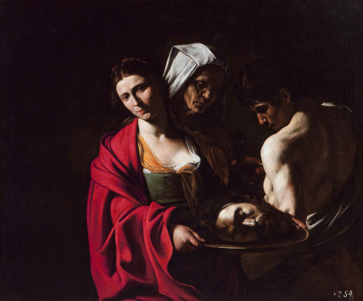
The second style we looked at was the style of Caravaggio, who was a Renaissance painter commissioned by the church to create many depictions of biblical stories. He used narrow lighting from a high position to create heavy shadows in his scenes, which makes the image very dramatic.


We then had a go with a couple of photography students who had kindly volunteered to model for us:


The main thing I discovered about this style of lighting is that using the shadows to your advantage was very important. I loved how, especially in the first picture, you could highlight facial expressions really easily and get a twinkle in the eye which I feel fits with the biblical style of painting.


Monday 16 February 2015

Dance Film- Tutorial and Further Research

My group's initial idea is to create a film in which a dancer is following a set of repetitive movements, stuck in this monotone routine, and their reflection begins to attempt to break the real person free from this kind of oppression. The dance would evolve slowly until the dancers were in unison with each other, and the reflection has achieved its goal of getting the real person to break free from the norm and follow their personal rhythm.

On 8th Feb my group had our first tutorial with Rachel, and this is a summary of what was said:


Glad that we are moving away from the idea of literal - office space,
although this was a good starting point.
I want you to think about that this video represents, what it is
saying -
We talked about:
Trying to escape from the constraints of daily life, particularly:
Facing what represses us
We get taught, told what we should do - the 'right' thing, the 'safe'
thing
As a person as an individual you want to do so many things, but
responsibility sometimes constrains us
Also a lack of motivation, self belief, the pressure of social
acceptability constrains us.
You liked the idea of two different movement styles to represent the
opposing sides - you'll need to find a dancer who can do both styles
that you are after.
I wonder if it may be about constrained v's free movement, how do you
constrain the body?  What texture is in the body when it is
constrained, v's when it is free?
Think about oppositions to represent free v's repressed:
In water / out of water
In the air / on the floor
Slow motion / Real Time
Close up / V's Wide Angles
Tension / Relaxed
contained in something / in a large open space
How does a viewer experience watching the expressed self v's the
repressed self?
So there is alot to work on before our next tutorial. To begin with, I did some research into other dance videos that were similar to the idea we had to try and get some inspiration from them:


Pas De Deux- This film is very simple in its concept, but it's very effective. It is very much my feeling that if you are filming a dance, you need to do something interesting with the camera. These kinds of effects I think are something we could play with.


Lodela- Similarly to Pas De Deux, this also plays with the camera, but more with camera angles. Since we are mirroring it has made me think of a way in which we could mirror in more ways than vertically, and in what ways our dancers could interact. I also love the simplicity of the set in this. I think our film has to conform to something more along these lines.


Rosas Danst Rosas- This dance film has the kind of evolving repetitive sequence we are going for in our film, and the group love the sound design, which is more driven by the movements of the dancers than music. We have agreed that this is the kind of attitude we want our sound to have.


Weightless- This film cleverly plays with the angle, and the set design as the set has been flipped as well as the camera to give this really mysterious feel to the film. I also love the simplistic movements of the dancers which to me suggest a sense of childlike wonder.


The XX 'Islands'- This music video is interesting as it involved repetitive movements which evolve over time, but it a less progressive way. The same shot and movements of the dancers are repeated over and over whilst the band themselves have different reactions to the movement over time, this then appears to affect the movements of the dancers as well. I like this idea of a repeating shot.

These videos have given me a lot of visual stimulation, and will allow me to come up with some further ideas which will hopefully further the film conceptually into something simple, but effective.

Maya 3D Workshop- 16th Feb

This week we were moving on to create our planet. We were using a new piece of software alongside Maya called Sculptris; a free modelling tool which is more like sculpting clay than starting from scratch modelling. It allows me to create very high polygon models very quickly to create more detail.

To start with we opened a sphere in Sculptris, and began to add craters and texture using the draw, pinch, inflate etc. tools:


After I was happy with my model, I next had to export the object as a .obj file, and then import it into Maya. I could then create a new sphere to add over the top of my high polygon object, in order to 'vacuum form' it to create a low polygon version:


To create this low polygon version, I had to do something called 'baking'. This is a way of taking the detail of an object and imprinting this onto another object. In this case, we would be using our Sculptris designed model to imprint the detail on to our low polygon Maya sphere. To do this, we opened up a window and chose our source model and our target model, and then selected that we wanted the normals to be created and baked onto the object:


This would then export the sample we have taken as an image to allow us to see whether our baking has worked, which we can tell by the normals exported matching that of the object, rather than having odd bulges or other anomalies:


Once this was done, I separated the Sculptris model from the freshly baked model to see the comparison:


On the left is the original, and on the right is baked version.

I then sampled it again like I did with the normals, but this time using ambient occlusion.


Now that we had done this to our object, I could think about adding colours and textures to make it look like a more interesting object. I can do this in the same way as I have in previous models. First, I add a blinn, and then choose an image to add to the planet texture. I added my colour to the ambient occlusion so not to lose the properties it brought to the object. However, now it looked flat and so I had to use a 'bump map' which allows me to add my normals to my blinn to preserve the detail I had gained from it.


Now I have my planet!

Wednesday 11 February 2015

Maya 3D Workshop- 9th February

In this session, we were going to review the spaceships of the last session, and start creating asteroids as part of our scene.

With reference to my spaceship of the previous week. I found it fairly easy to texture it at home. However, I came across a couple of issues. Firstly, my texture when applied turned parts of my model black:


As it turned out, I had to use the backface culling option to correct this. The tool may turn the backface of a model transparent to aid the speed of display or the manipulation of objects.

Also, I found that my object was partially transparent as I moved around it in Maya:


I couldn't figure out why this was happening, but I figured that it was something to do with my texture. As it so happens I had put transparency onto one layer of my texture for effect and then saved my file as a .png. However, this meant that the transparency was then applied to the whole of my texture and my model. So I saved it as a .jpeg, which fixed this issue.

Next I moved onto my asteroids. This was a much faster process as I didn't have to learn the basics of Maya as I did last week. However instead of box modelling, we started from a sphere:


We then started manipulating our sphere to create the distorted asteroid shape. Instead of manipulating faces, we were going to manipulate vertices instead. We could also use a tool called soft select, which would also manipulate the area around the vertex we had chosen in order to achieve a more natural and organic shape:


We then applied our checkered blinn and began UV mapping in order to add our texture. This took much more time than last week as we were working with a far more complex, organic shape:


After this was done, we created our texture as before, and then we had our asteroid!


Sunday 8 February 2015

First Photography Workshop- The RAW File and Using Smart Objects

This first photography workshop began by covering the use of RAW file in photography, and how we can use it to push our photographs even further in post-production. We talked about the use of jpegs vs the use of raw files, and then we were told to go and take some photographs in jpeg and raw in order to try and work with both in photoshop and see what our results would be.

We were told to try and use adjustment layers to recover our photographs in jpeg, which were purposefully shot using the wrong light balance settings. This was the result:


Although this is slightly better than the original image, the blue of the tungsten lighting setting really shows through. Also the darks are far too dark.

When we started editing our photographs in Photoshop, we were confronted by the camera Raw menu: 


This was explained to us as almost like being back behind the camera again. You can change your white balance settings, and many other features in order to improve the look of your photograph. The lecturer told us to use the histogram to see how much information we are getting, and what we are doing to our photographs when we change certain settings.


This second image, which was edited using camera raw in Photoshop shows a staggering difference between the two, and demonstrates clearly how much better shooting in Raw is, compared with jpeg.


First 3D Workshop: 2nd February

In our first workshop for 3D modelling, we were introduced to Maya, an industry standard piece of software.

We jumped straight into 3D modelling and were taught the cube modelling method. This is where you start with a 3D cube and then build your model from that one object. This is good practice and prevents trying to combine lots of objects together later on:


After we had completed the basic model of our spaceship, we had to light the model by creating UVs. This allowed us to determine how a texture would look when applied to our model to combat things such as stretching etc. 


After we had done this, we then took a snapshot of those UVs and brought them into photoshop to paint our texture:


Once we applied this to our model, we then could see the texture on the UV map. It took some trials and error to get them aligned perfectly,


Fields and Frames Briefing

On the 29th of January, we had our Fields and Frames briefing. Firstly, we went through our assessment criteria in an in depth way to try and pick it apart. A few things I picked up from this were:

- To innovate is to do a lot with a little. Start from simple things and build them up, you're doing things to create a difference and not to make imagery that looks like student work.

- Make sure you're aware of the critical, historical and theoretical framework in order to understand why you are making the pieces that you are making.

After this, Vicky (our lecturer) showed us some work that she felt to be relevant to the project and to the assessment criteria:

TV Interruptions: Tap Piece. This work by David Hall was screened on national television without warning to the public. This piece merely contains the act of a tap filling the frame, then water slowly drains diagonally across the frame. To me it feels as if the artist is trying to bring the audience's attention to the existence of the frame, in order to remind the audience that all they are watching is a TV set.

http://youtu.be/6h_5rSrZgL0

Turbulent By Shirin Neshat:


This piece is very simple, but very powerful in the way that it captures the audience and comments politically on a situation without the need to be literal.

We next looked at some artwork which is more on par with Vicky's own work as an artist. She uses celluloid a lot to make artwork, and so the following artworks are experimental with celluloid.

Dresden Dynamo By Lis Rhodes:


This piece was created by sticking transfers on to the film, and as well as creating pattern it also created sound when it went through the projector.

Night Sounding By Kayla Parker:


This film used already existing footage, and hand carving of the celluloid to create its own images and 'narrative'. I loved the neon in this piece, and the connection between the shapes carved and the real footage.

We were considering this idea of expanded cinema, and trying to come up with our definition of expanded cinema. Here are a few characteristics I wrote down:

- Multiple Technologies
- Screens
- Bodies
- Objects
- Live Events
- Think about the frame as a fixed thing. It can be any shape, it can go in and out.

From this lecture I was alerted to the idea of the frame being a malleable object. I liked watching the
examples of how you can manipulate celluloid to create a cameraless image. It has made me
consider how you could use the idea of form to create art, rather than focusing on subject matter.
However finding the balance between this and subject matter is something I have to reflect on
throughout my creative process.